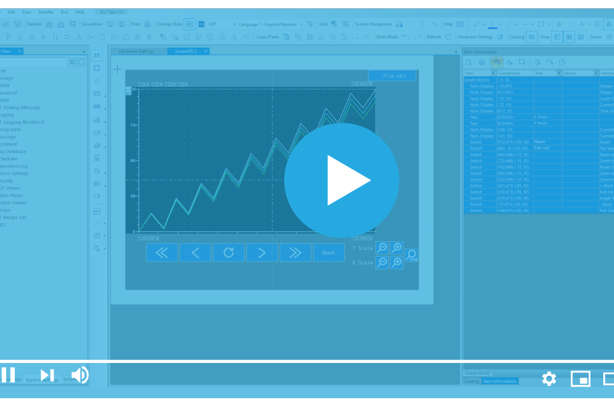
In our previous blog on the topic, we covered how to set up a logging server and a basic trend graph. Today, in this blog, we’re going to dive a little deeper into the subject of Trends by exploring how to modify a trend graph part in Smart Editor.
Modifying a Trend Graph Part in Smart Editor
First, here is a screenshot of the default part already configured with a logging server:
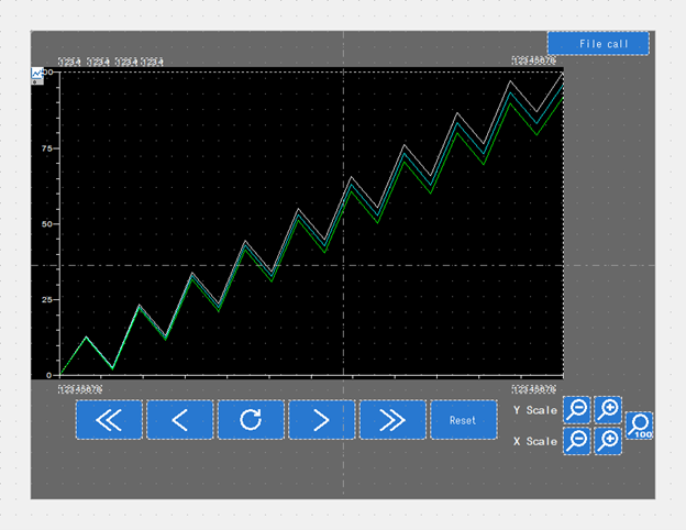
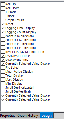
By default, it has a file call for saved data with scroll and zoom buttons. Let’s start by focusing on live information feedback rather than previous data. First, we’ll remove the scroll, zoom, and File Call buttons using the design panel shown below.
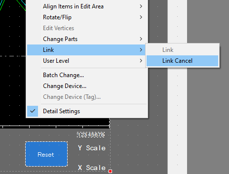
Next, we will select the entire part and unlink it by selecting “Link Cancel”. As a result, all applicable parts will no longer be grouped, enabling access to a full breakout list of each individual part.
Now we can edit each individual part as if they were parts we had placed normally, one at a time. After that, go ahead and so that we can move them together as one.
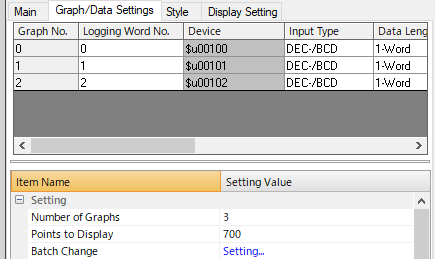
Under Group/Data Settings, we can change the number of lines we are graphing as well as the total number of points on the X axis. Note that the width of the display part must be a multiple of the Points to Display setting. So, a high DPI chart should match the exact width you want it to be. In this case, we will use 700.
Let’s touch on the different options for the display itself:
![]()
- Graph Number: Defines which line.
- Logging Word Number: References the assigned Logging Server for which Device Address it will be graphing. Each line can be assigned to any address from a single Logging Server.
- Device Address: This value is defined by the Logging Word Number.
- Input Type: Defines whether it is an integer or a floating-point number.
- Data Length: This must be either a Single or Double Word. The Float is automatically set to 2-Word.
- Min: Represents the value at the bottom of the Y-axis.
- Max: Represent the Value at the top of the Y-axis.
- Display Type: This can be set to Line Graph or Marker. A line graph draws a line between each point, while a Marker simply plots the data points.
- Line Type: Typically, this will be a Solid or Dashed Line; however, in the case of a Marker, there are several shapes to choose from.
- Line Thickness: Represents the width of the line in pixels.
- Color: This will define the color of the Line or Marker you choose.
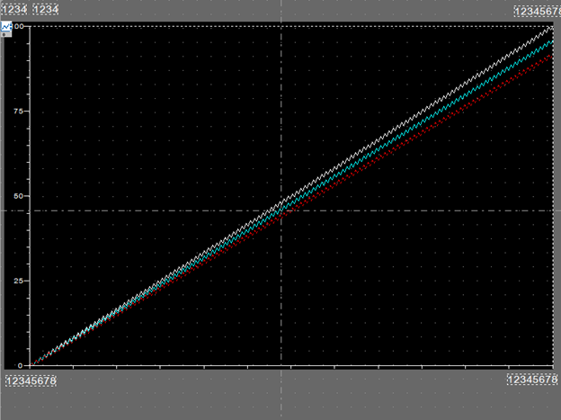
Ok, now that we’ve covered that, let’s make the changes to each line shown in the snippet above. Once you’ve successfully done that, the results of our changes should be displayed as shown below.
Now, we can cover the Style Tab. To start, under contents we see the following:
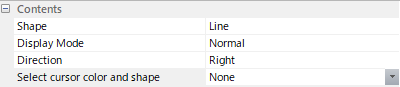
- Shape: This provides two options, Line or Rectangular Wave. Line draws directly from point to point. Rectangular Wave draws directly up or down from the last point then across to the next point.
- Display Mode: This feature matters when the logging server is not populated yet, as it ties into direction. For example, if Direction is set to Right then normal will start placing points on the left and draw them towards the right. However, Pen Recorder will start placing points on the right and the old data will advance to the left as new points are placed.
- Direction: This sets how the X and Y axis are pointed from the origin. Left and Right have time on the horizontal axis while Up and Down have time on the vertical axis.
- Select cursor color and shape: When setting up a scrolling graph this allows you to define the cursors color and shape.
For the purpose of this tutorial, we will change display mode to Pen Recorder.
Now on to Reference Lines, which provide a straight line along the X Axis and can be used to define important values such as target temperatures or max safe values.
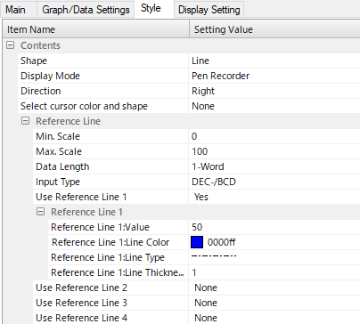
Note that up to four lines can be defined. They can be customized by color, line type, and thickness. Additionally, the Value, which is where the line appears on the Y Axis, can be set programmatically, so that it can be handled by engineers in the field or even PLC programming. The same control can be used for the min and max scale of the line. These can be handled as an integer or a float.
Finally, let us cover Scale:
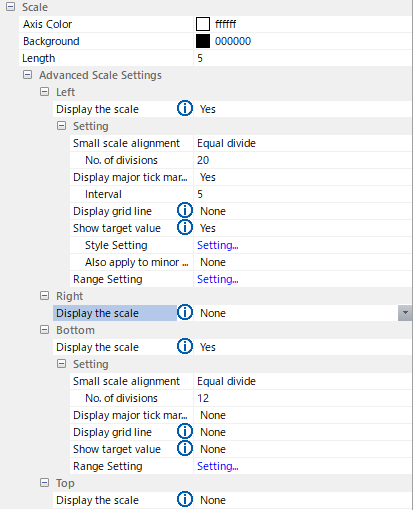
These settings allow you to change the appearance of the value ticks on the X and Y axis. For instance, since this is for a rapidly updating display, we may want to mark the right side as it scribes the line from the right.
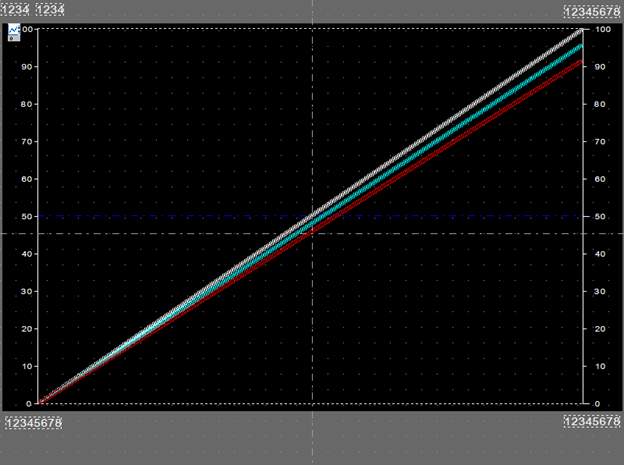
We now have a much more minimalistic display with twelve times the data points showing at once, removing the requirement for endless scrolling and resetting. For rapidly updating data, this is great as it will show over ten minutes of data for one second logging times.
Thank you for reading our blog. To see this process in action, check out our video on YouTube. Interested in learning more? Be sure to subscribe to this blog to stay up to date on critical technology integration processes.